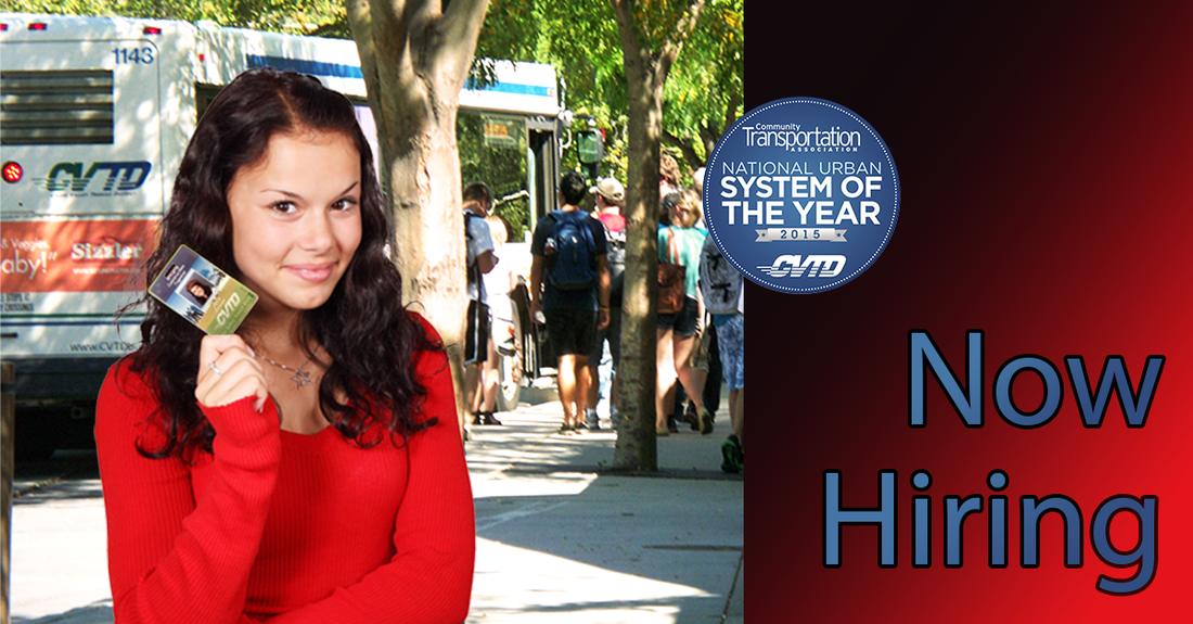
Exhibit 7Design: This ad was designed for Facebook advertising. To meet Facebook requirements, the text takes up less than 20% of the image. The image is divided into thirds, with the woman's face near an intersection to act as a focal point. Right alignment with the text creates strength, while red and the logo's blue are repeated throughout the image. A gradient adds contrast, and uses the same red-brown as the woman's dress and hair.
Process: I adjusted the original transit photo by increasing the brightness and contrast, bringing in the sides of the curves graph, increasing the exposure and using a mask to not over-expose certain areas, and manipulating the color balance to reduce the green tint. I used two public domain images of the woman (one holding a credit card and the other in a grey outfit). I used the quick selection tool to jump her head shot in the grey outfit to a new layer, and put that as the new employee photo onto a real transit employee ID card. I used the paint brush to mask identifying information on the ID card, and the text tool to write in "Jane Doe"'s fake information. I overlaid the image of the modified employee card onto the image of the woman holding up her credit card, using a mask and warp tool to make it appear realistic. I then used the color range, quick selection, and the refine edge tool to cut her out of the stock photo and place her onto the transit photo. The text was outlined with a stroke to help it stand out from the background. Photo credits: Local employer and free stock images Font: Myriad Pro Regular |
|
