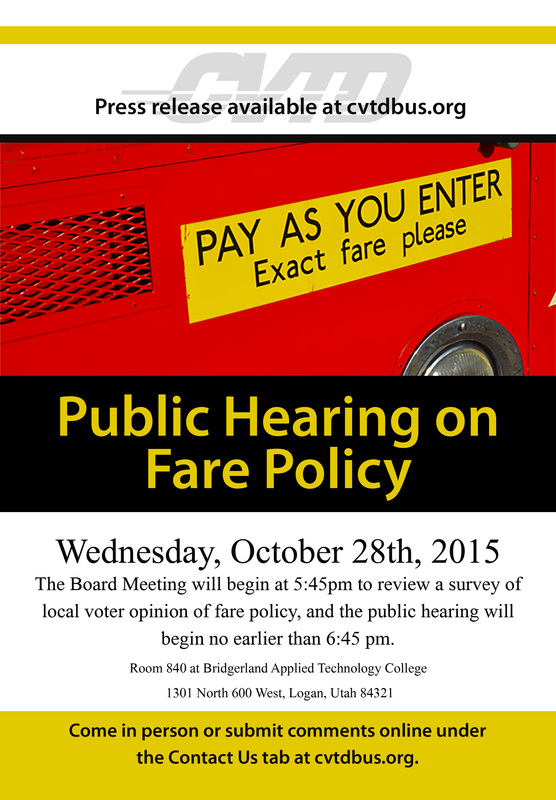
Exhibit 4Design: This flyer was placed on buses in our local public transportation system prior to a public hearing on fare policy. The flyer needed to be eye-catching and easy to read, as not all passengers would be situated near it. The hot colors jump out at the viewer and are repeated throughout the document for a sense of (assertive) harmony, and the center alignment helps create a sense of formality. Sans serif font is used for the most important headings, and serif font is used as a nice contrast to fill in with details. The company logo is used as a watermark at the top, and the most important information for how passengers could make their voices heard is described over yellow to draw the eye. Strong lines and color blocks are repeated throughout the document.
Process: A photo was inserted along the top third of the document with unwanted areas covered by a mask. The photo was adjusted in camera raw to increase vibrancy and saturation. Rectangles were made and filled with the shape tool. The company logo's opacity was reduced to 17% and altered with a black and white adjustment layer. Photo credit: Purchased from Dreamstime Stock Photos Fonts used: Myriad Pro Semibold and Microsoft Himalaya Regular |
|
