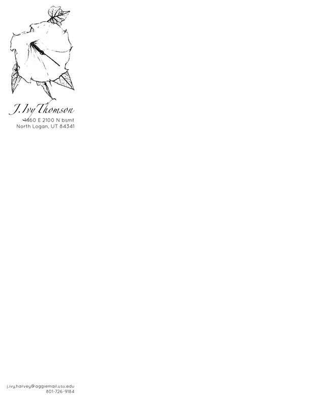
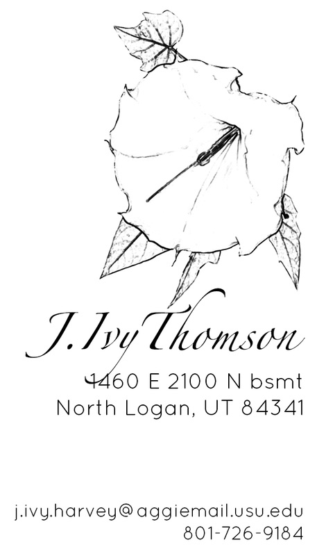
Exhibit 10Design: This set is the business card and letterhead for my personal use and representation. I am passionate about water-efficient landscaping, and chose the elegant moonflower as my logo. Black and white are a classic pair for contrast, and the delicateness of the moonflower pairs well with the serif font. Personal contact information is printed in an informal, modern sans serif. The simple design is strengthened and brought together by the right alignment in the business card, and by left alignment in the letterhead.
Process: The business card is 2x3 inches and the letterhead is 8.5x11 inches, both with 300 dpi. I used the pen tool to select the moonflower image out of a color photo from my phone. I used the filter gallery to stylize the photo with glowing edges, then inverted the filter to make it a sketch. I desaturated the image to make it black and white, and used the threshold adjustment to bring in the black and make it darker. I jumped the flower to its own layer, and used the color select tool to delete all the white pixels. I used the eraser tool to get rid of all the dew drops (which looked like warts), and turned the resulting image into a brush preset. I applied several brushes on top of each other to make it even darker, and used the final brush, flipped horizontally, to produce the flower image on the letterhead and card. T Original photo: Ivy Thomson Fonts: Zapfino and Quicksand Light |
|